 We are pleased to officially launch our new logo! You may have seen it already in a few places (emails, Oasis website, etc). From here on out you will see more of this and a whole new look rolled out in our web and print materials. We are excited about this but recognize it is only a small part of our process of restructuring and re-visioning the CABC has been going through the past few years. Through much prayer and consultation we believe this process will position our denomination for health and growth in the years to come.
We believe God is calling our churches to our 2025 goals as the path to that continued health and growth (read about the 2025 goals here).
Our methods may change but the message is the same.
This new look incorporates:
Our vision – Healthy Churches, Missional Churches
Our mission – As churches we Impact Leaders, Infuse Culture and Ignite Mission to bring our communities to Christ.
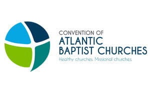
Here is a description of the new logo:
Each of the four panels represents each of the four Atlantic Provinces. The four panels within the sphere are intended to show our strength and interdependence as churches collaborating and partnering together for the mission of God. The panels can also be thought of as sails, which is certainly a part of our culture in Atlantic Canada. Building on that, the sails give a sense of the wind behind them propelling us forward.
The cross in the middle is significant to our faith. You may see a representation of a person in the middle either embracing or arms wide open ready to receive.
There is a sense of movement and fluidity with the expansion of the panel on the bottom right, which also gives a 3D look to the sphere. This also gives a sense of openness. This is significant, as we believe that partnerships are a key part of our accomplishing our mission. The sphere is also representative of the world we are called to serve (interpreted as both local, regional and beyond).
The colour scheme is a vibrant and contemporary mix of blues and greens. The two shades of blue represent strength – the strength of our 450+ congregations, as well as the strength of the support system(s) we provide them. Meanwhile, the green represents growth, aligning with our vision for the future and commitment to innovation, as well as the work we do to help churches grow independently.
Come join us on this journey!


